Anova Furnishings Website Redesign
Responsive Design


Creative DirectorMatt Steel
DesignersMatt Steel, Tyler Sanguinette, and Jason Tasso
CompanyGrain, Inc.
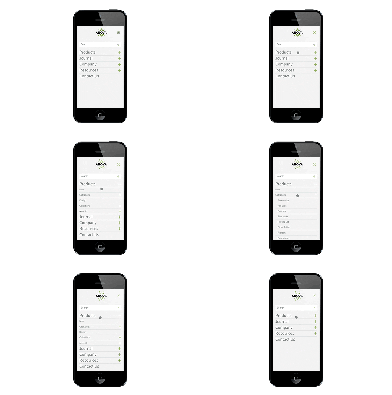
My role in this project was to complete the desktop, tablet, and mobile wireframes for the case study, articles, colors & patterns, Anova Difference, and contact pages along with designing their user interface. I designed the mobile navigation for the site as well.
Case Studies and Articles:
Grain proposed the addition and use of case studies and articles on the new website to better showcase Anova’s products and help drive people to content they would want to see. The articles give the company an opportunity to share information based on new products, updates, and general communication with their product audience. One of the main features of this page pattern is a sidebar typographic element that allows users to see which products are specified in the case study or article.
Colors & Patterns:
The goal of this page was to easily display all of the company’s colors and materials in an easy to use and appealing way.
The Anova Difference:
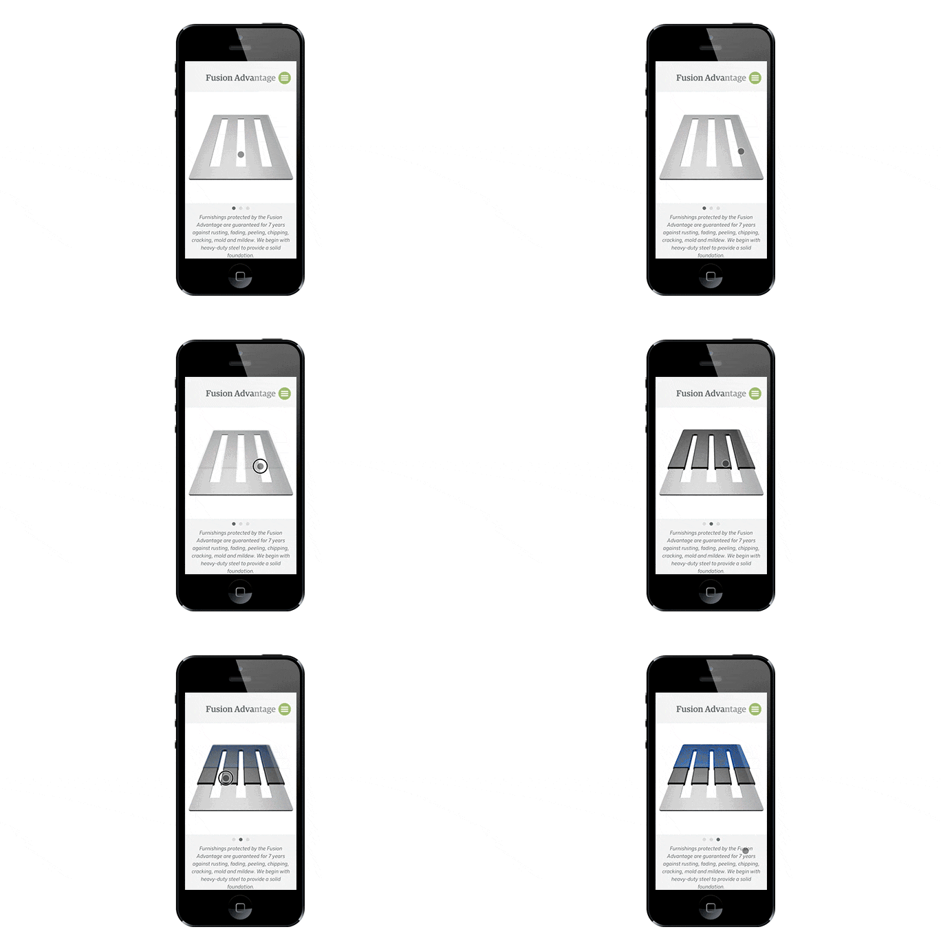
This page helps customers achieve their goals in sustainability and LEED certification by showcasing Anova's most fundamental product details. An important section, the Fusion Advantage, is an interactive element that guides users through each layer of Anova’s fusion crafted products.
Contact:
Anova’s contact page is the most visited page on the site. We designed it so the ability to submit a message and/or contact a local representative was intuitive to the user. During the “Contact A Local Representative” process, the site guides you based on the information you enter. For instance, if I select Missouri, the next screen will show only Missouri representatives. Upon clicking the contact button for that specific representative you then advance to a form.