Attack The Block Motion Titles
Logo, Motion, and Print Design
Student WorkJunior level motion project at the University of Missouri — St. Louis (2012)
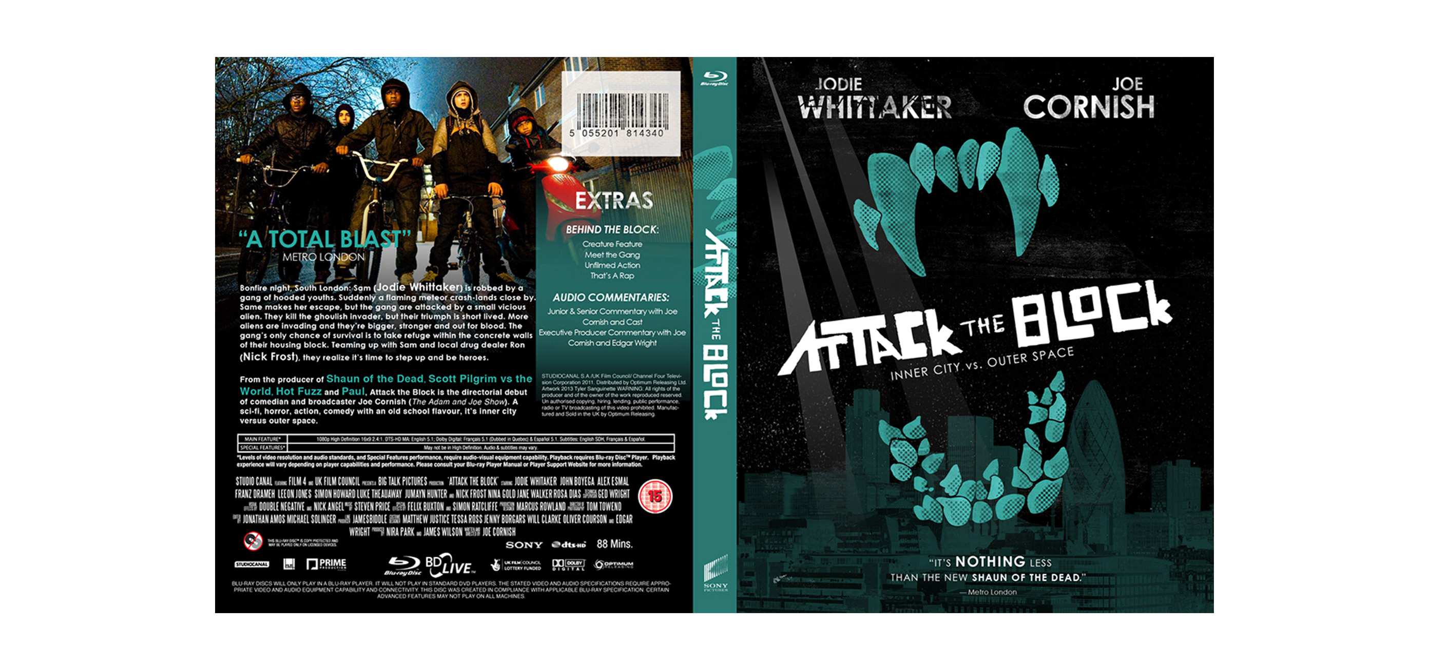
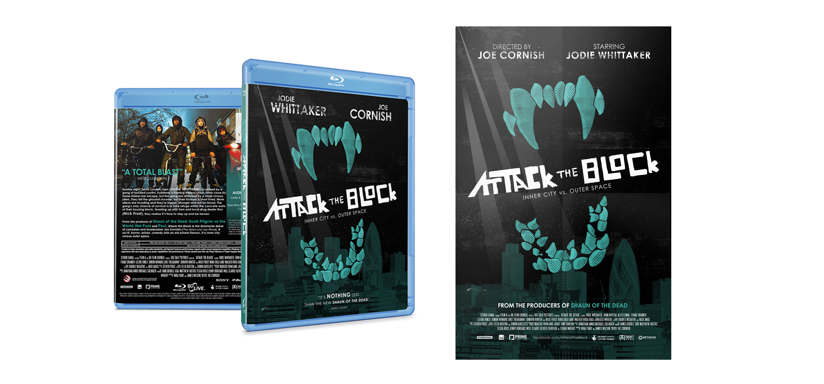
The goal of this project was to create a redesign of a movie with a unique logotype that could be displayed on a 13x20 full bleed poster, blu-ray case, and animated motion title sequence. Attack the Block is set on a council estate in South London on Guy Fawkes Night, and, with some coming of age themes, the plot centres around a teenage street gang who have to defend themselves from predatory alien invaders. The color palette is based on the actual color of the alien's teeth and references the dark night setting. Its logotype is hand lettered in order to evoke a Saul Bass feeling and allude toward the grittiness of the movie's characters. It [the logotype] is used across mediums to create a consistent brand. In the video, the stars in outer space draw a connection with the aliens and the actual start of the movie which is a night scene. I choose a complimentary typographic approach for the title animations so they [the titles] would reflect the subtle yet unpredictable nature of the aliens.